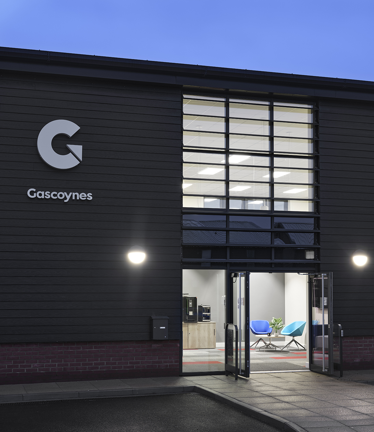
The concept for Gascoynes was based on a Minimalistic and Contemporary design. We set out to create a design which could be functional but still elegant and unique. As always at Bluespace, we felt it was important to reflect Gascoynes’ brand within their design, and encapsulate their modern approach to accountancy within their office space. By using brand colours within our designs in feature walls, furniture, finishes, fabrics or even flooring, we ensure we reflect each client’s branding.
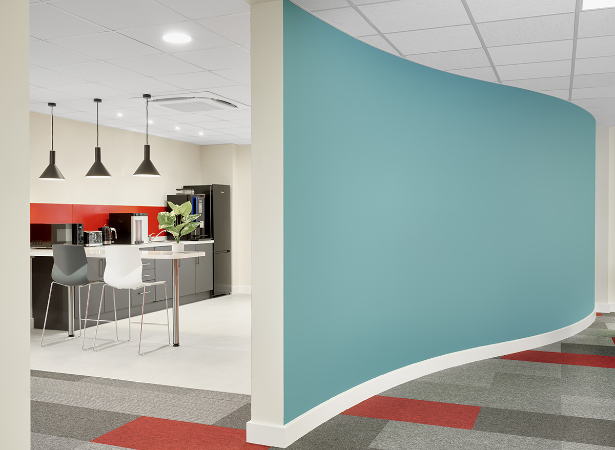
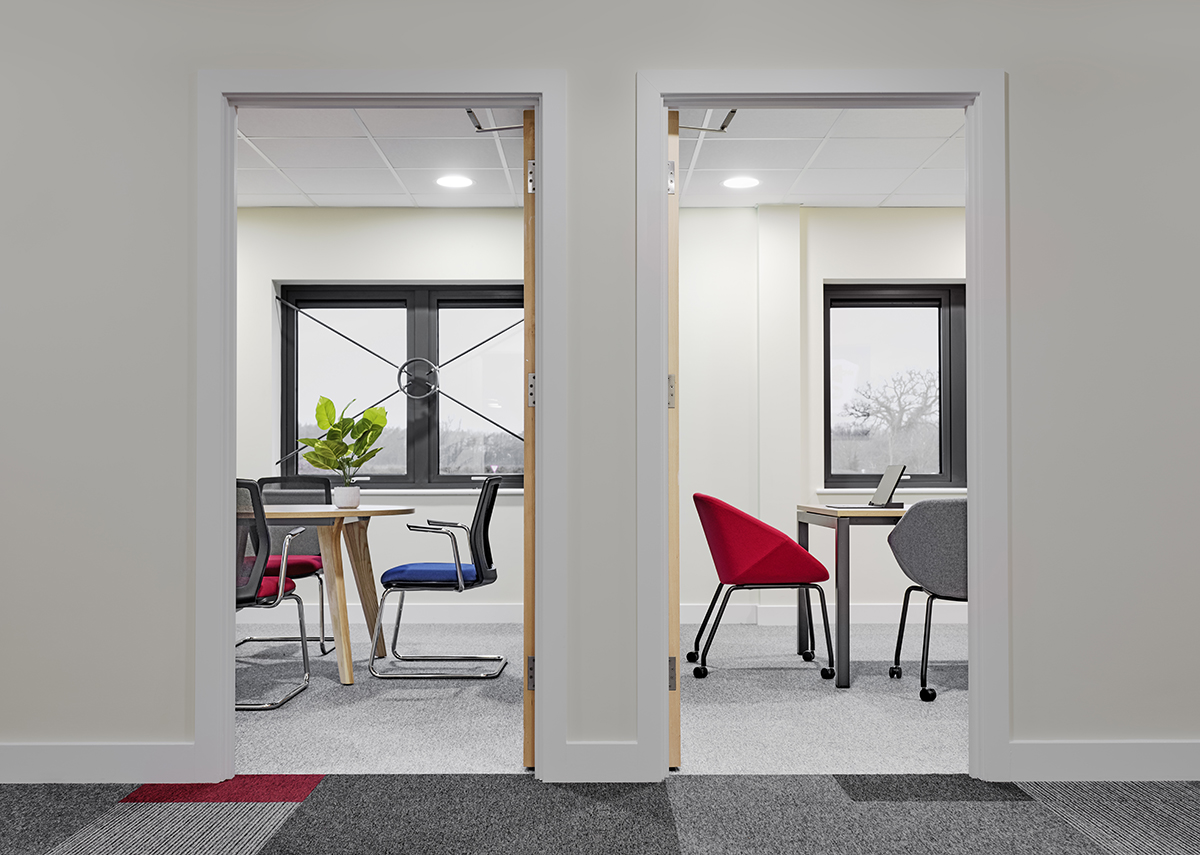
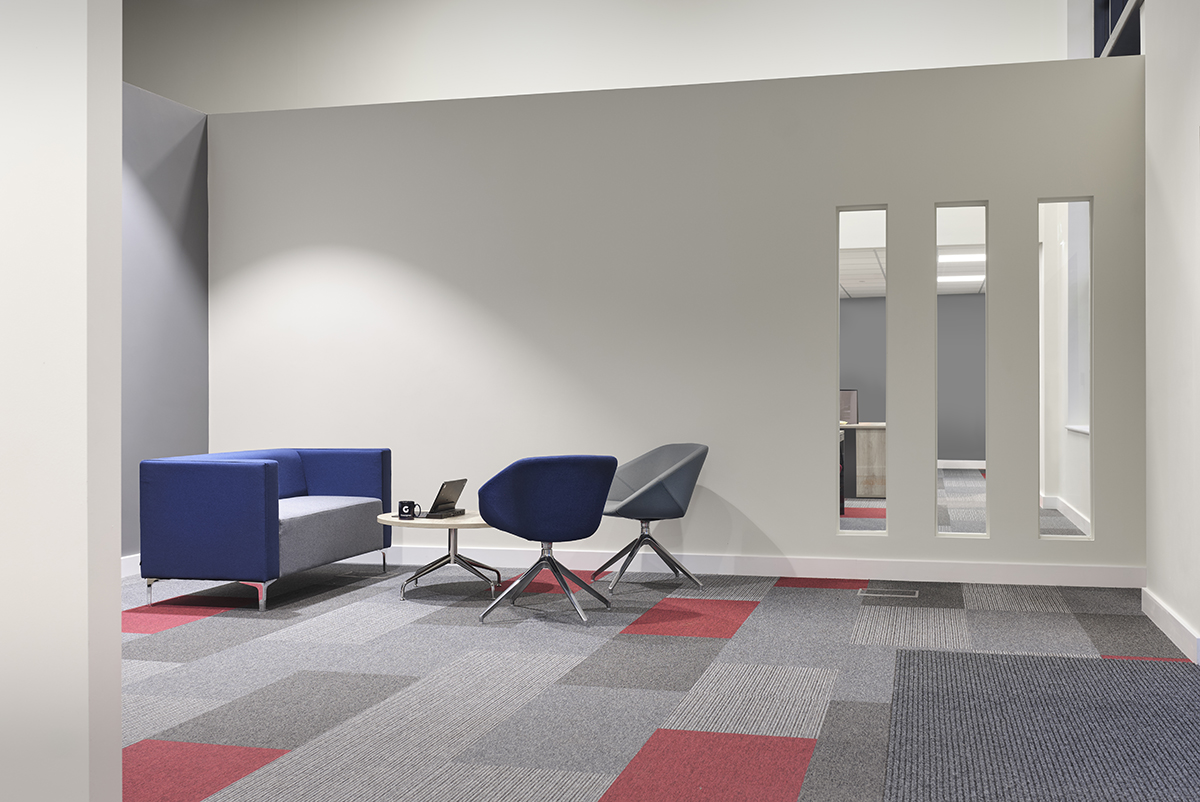
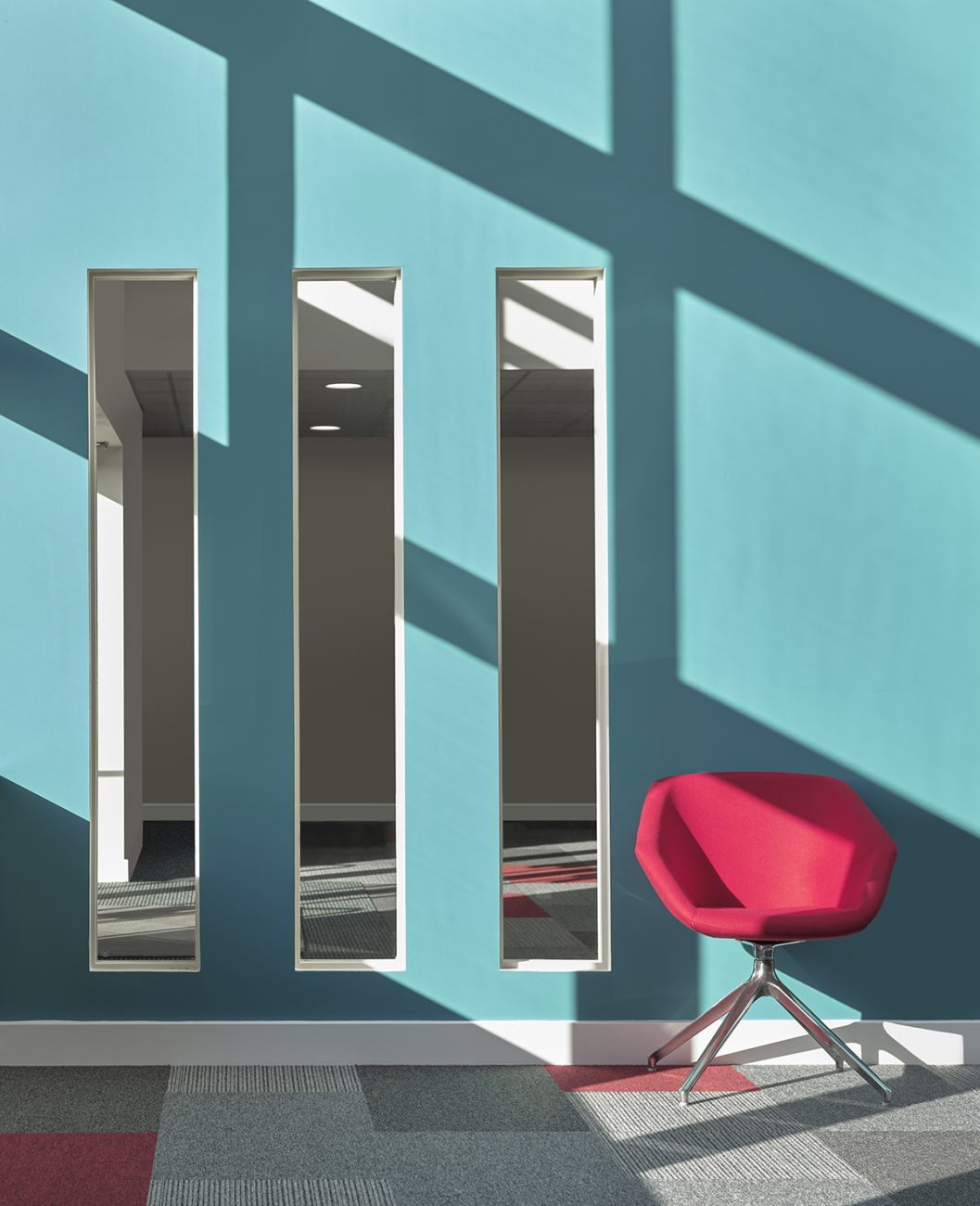
The large curved wall in the office is a unique and striking feature which allows us to separate the space without making any part feel enclosed. Blocking the entrance to the office area was a priority, but as we wanted to keep the office as open as we possibly could, we did not want to incorporate full height walls. So our designer had the idea to have a half height wall with 3 vision panels so that the areas were separated but not enclosed.
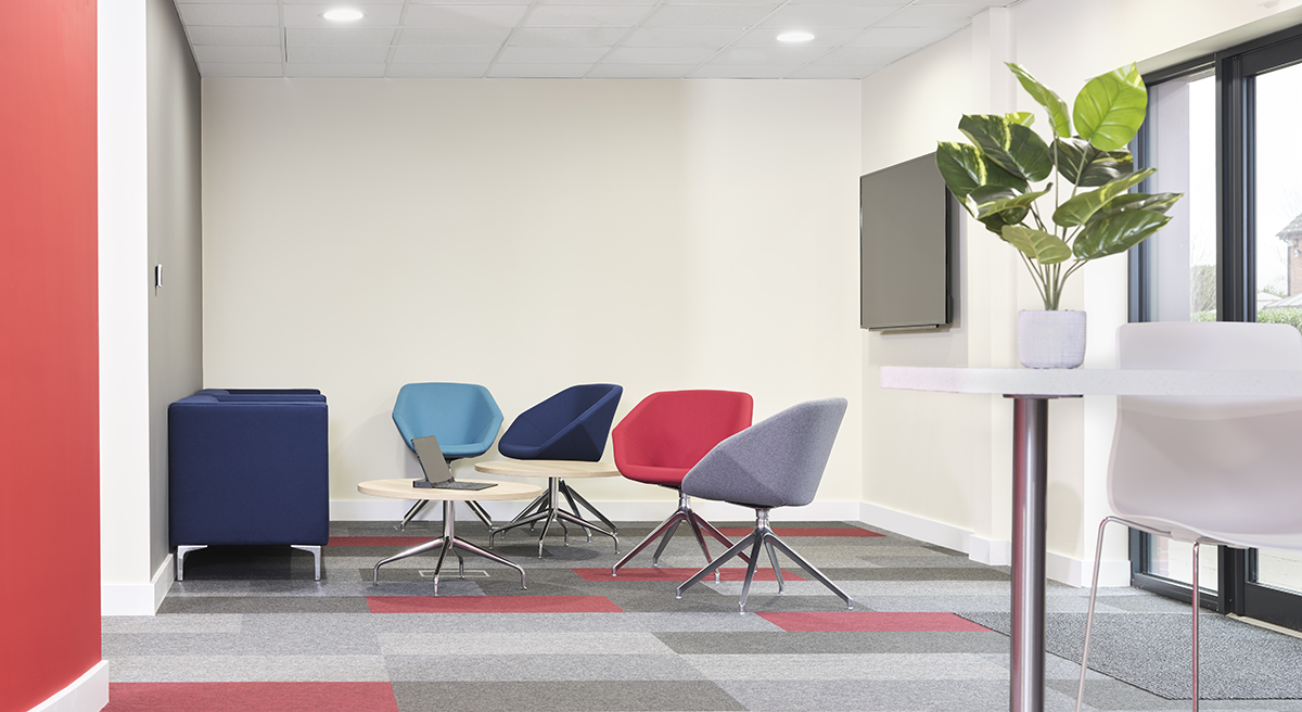
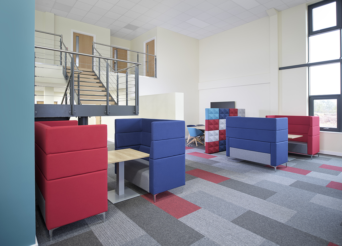
Whilst we wanted to keep the office as open as possible, it was still important to include features that allowed privacy. We included an acoustic wall with Fabricks from Ocee to offer acoustic and visual privacy, without building permanent floor to ceiling walls. We also created an informal meeting space by including high back Sofas by EVO from Elite.
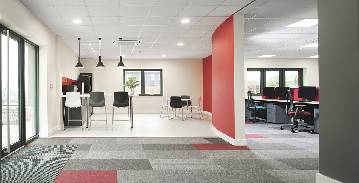
Whilst considering the layout of the space, we thought the store room next to the tea point could be the perfect place to be used as a breakout area with soft seating. We wanted the design of both spaces to be minimal, elegant and fresh.The tea point would have a counter balcony with some graphite pendants above to match the window frame and the contemporary look from the main office.
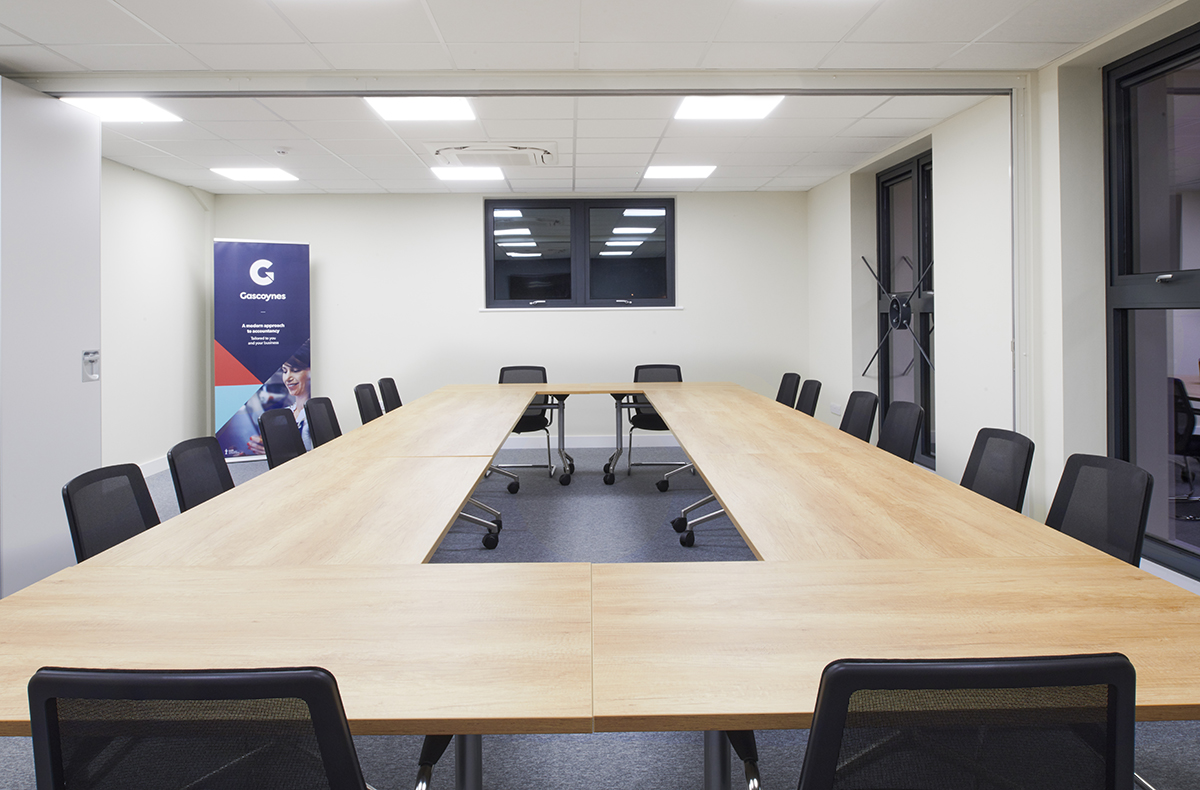
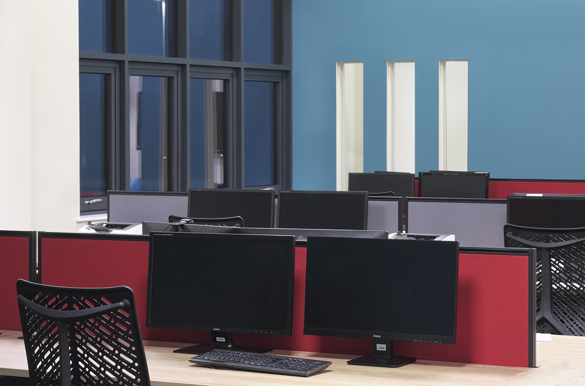
We selected furniture that reflected the company’s modern approach to business, including Clara chairs by Torasen in the brand colours to create a geometric, modern feel. The desks had graphite frames to match the building’s key features: the giant windows. And mixing the graphite frames with natural Nebraska oak tops gave the space that contemporary touch.
The building also has some featured decorations in grey, teal and red. We paid special attention to the curved wall, which we used as a partition to create contrast. The curve gives us the sense of flow and tranquillity, and we saw the opportunity to create a striking contrast between the spaces either side of the partition. A calm side in the office area in teal, and a more exciting side in the tea making/break out area. As you walk in the tea making area from the office you can really feel the difference a featured partition can make in a space.
The result of this project is a vibrant, open and modern office space. After seeing the clients’ reactions to our design we could not be prouder. A happy client is a successful project! Here’s what Director Ashley MacDonald had to say about our work:
“Bluespace were brilliant throughout, they were able to provide expert knowledge and a creative imagination to our project that we never would have been able to come close to. From day one where we sat down with Jonathon to discuss the idea of working together Bluespace matched our enthusiasm and excitement in the project and their eye for details was incredible.
Bluespace provided design and furnishing options for us and we couldn’t be happier with the end result. Our staff have been in the new office for less than a week and the difference in attitude and morale is markedly different. We would highly recommend using Bluespace.
Once again thank you so much for everything you’ve done in helping us put this together, we are already reaping the benefits of the move and the spaces created.”